 The charts on the meeting stats page show you how you spend your meeting time, and are intended to be simple and intuitive. However, as with all such things, there is always scope for misinterpretation and things going wrong, and so this page provides an explanation of the Meeting Stats page, and the charts you will find within it.
Uploading your data to the charts
 If you have uploaded your data through the Calendar Add-in the charts showing how you spend your meeting time should appear automatically when you go to the Analysis > Meeting Stats page. However, if you do not have the add-in installed correctly, or if something has gone wrong, you may see a page full of messages like the one on the right. To resolve this issue, please go to our troubleshooting page.
Setting the ‘what’ and the ‘when’
 By default, the Meeting Stats page will show you the results across all of your personal meetings for the last 30 days. However, you can change these settings using the panels shown on the right.
Clicking in the boxes on each panel will enable you to set different date ranges and focus on meetings with particular characteristics. Read More
Data Source
If you have been set up with permission to see your team’s results, you can select this option in the Data Source panel, and then select which particular part of the team you wish to look at.
Access to other people’s feedback data (the meeting value-add donut, and the spider diagram) is intended for coaching and support purposes only.
Time Period
Meeting stats can be viewed for a particular calendar month, or any custom period up to 30 days. Depending on the size of the population being viewed, a full 30 day snapshot can take some time to process, so please be patient.
It is also possible to select a forecast view of the upcoming 30 days in your calendar. While this is subject to change as your calendar evolves, it does provide the opportunity to identify issues and make adjustments ahead of time.
When using the custom range, the first date clicked sets the start of the time period, and the second date clicked sets the end – dates beyond 30 days of the selected start-date are crossed out as unavailable for selection.
Filters
Filters allow you to see the characteristics of meetings that fit with a particular criteria, which can be useful when you wish to do something about that criteria. For example, you may want to see what sort of meetings don’t include objectives or agenda.
By setting this as a filter, you may see that the Donut for meeting size shows that the vast majority of meetings without an agenda are around 30 minutes or less (in which case you may feel this is understandable) or you may see that there are still a lot of longer meetings in this population, in which case you may feel that this needs addressing.
You can set filters by clicking in the filters box. This will open up a drop-down list where you can select a particular characteristic and limit the analysis to meetings with that characteristic. Multiple filters can be applied. Clicking the cross to the filter’s right will cancel that filter.
You can also apply filters by clicking the criteria in the key (the list of criteria beside each donut) of a particular donut. Again, multiple filters can be selected at the same time in this way, and released by clicking the ‘X’ beside the applied filter in the Filters panel.
PLEASE NOTE: In order to provide this level of functionality, the charts need direct access to the individual meetings concerned, and can therefore only show results and averages on a ‘per-meeting’ basis. Please bear this in mind when comparing results from this page with results from other pages in Inspirometer. Otherwise you may get confused comparing averages on this page (average per meeting) and averages on other pages (average per hour).
Timespend Histogram
 The primary chart on the Meeting Stats page is a histogram showing the proportion of each working day that has been taken up with meetings and other commitments, and how much is left for other productive work.
Hovering over the bars of the histogram will provide you with a quick overview of the number of meetings and time spent.
More detail on the meetings reflected in the histogram can be found in ‘Manage my Data’. Read More
Meetings are reflected in the bars at the bottom of the histogram, and are broken down by those you hosted (which are shown in blue) and those you attended (which are shown in green) and those which are asynchronous (shown in purple).
Other activities which take time out of the working day, such as leave (yellow), travel (orange) and other absences (grey) are shown projecting down from the top of the histogram. This leave the white band in the middle as an indicator of the time remaining available for other productive work.
 Clicking the meeting bars on the Histogram will list out the titles of the meetings (in personal view) and provide you a link to any meeting feedback (report) received for those meetings. If they are your meetings, you also have the option to share those reports with your attendees.
Reading the Donut Charts
Donuts are essentially pie charts which breakdown the population of meetings shown in the primary histogram to reflect what proportion of those meetings fit with certain criteria in terms of: size; length; recurrence; disciplines; etc. Most of the remaining charts are of the ‘donut’ type. The thicker blue donut on each reflects the breakdown of meetings hosted (and which it is easier to do something about) while the thinner green donut reflects the breakdown of meetings attended. Read More
The angle of each segment is proportional to the number of meetings that fall into that particular criteria. For example, a 90 degree segment would represent a quarter of meetings.
The two numbers in the middle of each Pie Chart reflect the average values, and are colour-coded to the donut rings – blue for hosted meetings and green for attended meetings. Hovering over a segment in the donut will provide a bit more detail on that segment – the criteria it represents and the number of meetings involved.
Clicking on a criteria in the key (the list of different criteria shown in the top right corner of the donut) will set a filter for that particular criteria across all of the meeting stats, so that the user can then see more detail about the population of meetings which conform to that criteria.
Meeting Size
 The Size chart reflects the proportion of meetings that are 1:1, small (5 people or less), medium (6 to 10 people) and large (more than 10 people involved in the meeting).
In a large organisation, it is not unusual to find that the average size of attended meetings is higher than the average size of hosted meetings – this is due to the effect of large meetings such as ‘all-hands’, and ‘town-hall’ meetings. [How to read the donut charts]
Meeting Duration
 The duration chart shows the breakdown of what proportion of meetings fall into which length groups. Please bear in mind that, while meeting length does bear a relationship with meeting quality, this is a subtle and complex relationship and it would be unwise to consider it too simplistically. Read More
Meeting duration is often a good indicator of meeting effectiveness, since it is generally true that more effective meetings require less time to arrive at a shared conclusion. However, while better meetings lead to shorter meetings, the converse is not necessarily true and edicts like ‘No meeting longer than 30 minutes’ can simply drive issues underground and lead to more meetings.
As with all the donuts, the proportions in the chart are based on the number of meetings, not on total meeting time spend.
However, this has a more pronounced effect on this chart where the 5 hour segment and the 30 minute segment would shift relative to each other by a factor of 10. [How to read the donut charts]
Participants
 The Participants chart reflects the proportion of meetings that are entirely internal, vs those which are primarily external (half or more of the invitees are external). Mixed is used to denote meetings where there is external participation but the majority of the participants are internal. Read More
Please note that the figure for whether attendees to your meetings are ‘internal’ or ‘external’ to your organisation are based on the domain element of their email address. Thus, customers, suppliers, business partners, and in some cases contractors may all appear as external. Conversely, if you are part of a large conglomerate selling to another part of that conglomerate, customers may appear as ‘internal’.
In general however, the ‘internal’ figure aligns to the overhead consumed in running the business, while the ‘external’ figure aligns to exploring external opportunities and possibilities. Therefore a shift from ‘internal’ to ‘external’ may reflect internal processes becoming more efficient, thereby freeing off more time to network and engage with customers. [How to read the donut charts]
Recurrence
 Recurrence shows you the proportion of your meetings that are set up to repeat periodically – in other words, they have a recurrence rule set within the organiser’s calendar, such as every fourth Thursday.
Please note, meetings which are entered separately into your calendar on a set pattern do not show up as recurring. Read More
Whilst recurring meetings are not in themselves an issue, they are prone to become habitual and continue past the point that their purpose, length, membership and frequency would have benefited from some sort of review. Furthermore, they are easy to set up on a predictable patterns which may not be the most productive pattern.
If the balance of recurring meetings looks high in proportion to the extent to which your projects and admin are entirely routine, you may benefit from undertaking a review of each of these series of meetings, and to schedule a repeat of that review at least annually and possibly more frequently. The review should consider the items described above, and might reflect creative input as to how things might be shaken up a bit through asynchronous options or flexible/cycled participation. [How to read the donut charts]
Objective / Agenda
 Objective / Agenda shows the proportion of your meetings which have an objective and/or agenda included in the body of the invitation.
Clearly the technology interpreting this does not have the discernment of the reader, and so these need to be in a particular format to register. Read More
Clarifying the objective for a meeting is an essential component of meeting effectiveness. Only where the objective is clearly defined can:
- meeting content and activities be efficiently designed to meet it
- participants be selected and see the value they can bring/gain
- attendees prepare themselves for playing their part effectively
- conversations be brought back when they drift from the objective
- the agenda be validated as an effective means of delivery
… and all of these bullets are key to effective and efficient meetings. Furthermore, for meetings longer than 30 minutes, the provision of a timed Agenda helps to ensure that the meeting time is efficiently apportioned and that attendees can recognise the most efficient point to raise particular issues or ideas.
Please note: If your meetings include objectives and agenda in the invite, but this does not show in your stats – please check the format you are using carefully.
The word objective needs to be followed immediately by a colon and a space and then text on the same line – thus: Objective: To explain. And the word Agenda needs to be followed immediately by a colon, and then by numbered items on new lines preceded by the # symbol – thus: #1 First point.
The easiest way to get the right format is to use the placeholder which the add-in automatically includes in the body of new meeting invitations. If you have the add-in, but are not seeing the placeholder, it could be that you are actually inviting people to an appointment. To set up a meeting correctly in Outlook, right-click your calendar where you want the meeting to appear, and then select ‘New Meeting Request’ from the Right-Click menu. [How to read the donut charts]
Meeting Type
 The Meeting Type chart shows the proportion of your meetings which are physical (held face to face in a defined location) and virtual (held between people at separate locations using the internet, telephone or other virtual meeting technology).
It is also possible within this chart to capture asynchronous meeting time scheduled into your calendar using the term Async in the location field.
Read More
The Meeting Type donut also includes the time you spend in travel. However, because it does not know whether the travel is associated with physical meetings you are hosting, or physical meetings you are attending, it simply splits the total equally between the two.
A shift in the balance between virtual and physical meetings reflects the extent to which you are able to effectively utilise virtual meetings to reduce the time, financial and ecological costs of travel. And it may also reflect effective use of the wealth of additional functionality that is available through virtual meeting technology to augment the more traditional (and antiquated) ‘sitting round a table’ approach.
It may seem counter-intuitive to schedule Asynchronous meeting time into your calendar, but the reason for doing so is not simply so it registers in your stats. This article on Asynchronous meetings makes it clear why scheduling asynchronous time is key to its success. [How to read the donut charts]
Feedback Enabled
 The Feedback Enabled donut shows the proportion of meetings the user is hosting and attending where Inspirometer feedback has been enabled.
Feedback is enabled for meetings by including meetings@inspirometer.com in the attendee list for the meeting. Read More
meetings@inspirometer.com is automatically included in the attendee list for meetings when it is set up from an Outlook account with an active add-in. In the event of feedback not being required, perhaps for reasons of sensitivity or the material under discussion, the meetings@ email address can easily be deleted, and the meeting go ahead as normal.
It is possible to include the meetings@inspirometer.com email address, and subsequently use the feedback options to disable meeting feedback at the time the invitation is sent. This does not register as ‘feedback enabled’.
For further guidance on setting up feedback for meetings, see Capturing meeting feedback.
[How to read the donut charts]
Meeting Value-Add
 The Meeting Value-Add donut shows how the feedback your meetings have received breaks down.
It is important to remember that this donut is not an evaluation of the user’s meetings (or indeed of the user themselves) but simply a self-assessment of what was received from the meetings for whatever reason.
Read More
Inspirometer is at pains to emphasise the following very important statements related to any meeting feedback data:
1. Your feedback is NOT an evaluation of you! It is simply a reflection of ‘how people feel’ as a result of these interactions.
2. ‘How people feel’ is a result of a number of factors, many of which may be outside of your control
3. However, it is important for you to know ‘how they feel’ since this will affect what they do (or don’t do) as a result, and may affect your intended outcomes
4. Furthermore, while you may not control all the factors which affect ‘how people feel’, you are probably well positioned to help facilitate their improvement
For more insight on this, please read our guide https://toolchest.org/wp-content/uploads/Providing_and_Receiving_Inspirometer_Feedback_v1.1.pdf and our article https://toolchest.org/meetings_clinic/what-does-it-mean-if-i-receive-feedback-that-is-less-than-perfect/ [How to read the donut charts]
Approximate Total Spend
 The approximate total spend is obtained by multiplying the hours consumed by hosting or in attending meetings by an approximate hourly cost of employment for those people. The approximate hourly cost (and its currency) can be adjusted by clicking the figure in the purple box. Read More
The green figure is the cost of time incurred by all of your people in attending meetings for the time period, whether hosted by your people or not.
The blue figure is the cost of time incurred by your people as a result of them organising meetings, which includes all of the people attending whether they are your people or not.
Clearly there is some overlap within these two figures.
Effective Overtime Hours
 Effective overtime hours reflect the time spent in hosting or attending meetings or in travel outside of normal working hours. Normal working hours is currently set at 09:00 to 17:00. Read More
From the team view perspective, this figure is averaged across the population. Blue figures relate to meetings hosted, while green figures relate to meetings attended.
Whilst it has become accepted in many cultures that senior roles need to extend outside of the normal working day, particularly in respect of global businesses, this is not a particularly healthy state of affairs, particularly when it is taken to extremes. Furthermore, where unpaid overtime is used as a buffer it can hide internal inefficiencies that might otherwise get resolved if their cost was recorded in some way.
The effective overtime hours, whilst only recording the time spent in meetings, provides a means to see whether this figure is growing or declining and therefore begin to introduce appropriate checks and balances which may be beneficial to long-term mental health.
Productivity Blocks
 Productivity blocks show the average amount of time remaining to people outside of travel and meetings where they can concentrate on doing their work. They reflect separate contiguous blocks of 90 minutes duration. Read More
The figure of 90 minutes is taken as the period which allows people to wind down for one meeting, and wind up for another, and get a good hour of thinking time in the middle. This provides enough time to read yourself into the subject, catch-up on your thoughts and begin to further develop them.
Clearly there are equally justifiable cases for making a block 60 minutes or 75 minutes, or two hours. However, blocks of 90 minutes still provide a reasonable indication of how much time is available to your people for deep strategic insight.
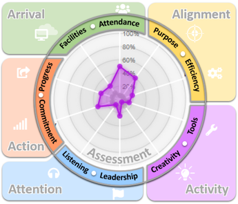
Spider Diagram
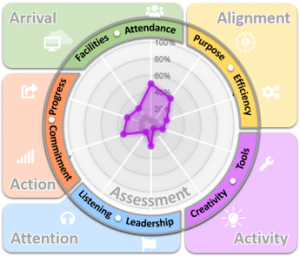 The Spider Diagram analyses meeting feedback which has been categorised (or ‘applied to’) the different aspects of meeting effectiveness. The purple trace reflects the average value-add feedback associated with each of the aspects, while the mid grey trace provides an impression of the relative volume of feedback which comprises that average.
Clicking the axis labels takes the user to the meetings clinic for that aspect, and presents them with a range of simple strategies which might be adopted to improve that particular aspect of meetings. Read More
The resources and guidance provided through the clinic are organised into ten key aspects of meeting effectiveness:
Each contains a wealth of best-practice strategies and ideas to improve effectiveness in that area of the meeting. These are generally fairly short, and are intended to be relatively easy to implement.
Inspirometer account holders can also access these strategies within their account by clicking the relevant ‘members’ link above. Non account holders can access related public resources by clicking the relevant ‘public’ link.
 The charts on the meeting stats page show you how you spend your meeting time, and are intended to be simple and intuitive. However, as with all such things, there is always scope for misinterpretation and things going wrong, and so this page provides an explanation of the Meeting Stats page, and the charts you will find within it.
 By default, the Meeting Stats page will show you the results across all of your personal meetings for the last 30 days. However, you can change these settings using the panels shown on the right.
 The primary chart on the Meeting Stats page is a histogram showing the proportion of each working day that has been taken up with meetings and other commitments, and how much is left for other productive work.
 The Meeting Value-Add donut shows how the feedback your meetings have received breaks down.
 The approximate total spend is obtained by multiplying the hours consumed by hosting or in attending meetings by an approximate hourly cost of employment for those people. The approximate hourly cost (and its currency) can be adjusted by clicking the figure in the purple box. Read More
 Effective overtime hours reflect the time spent in hosting or attending meetings or in travel outside of normal working hours. Normal working hours is currently set at 09:00 to 17:00. Read More
 Productivity blocks show the average amount of time remaining to people outside of travel and meetings where they can concentrate on doing their work. They reflect separate contiguous blocks of 90 minutes duration. Read More
 The Spider Diagram analyses meeting feedback which has been categorised (or ‘applied to’) the different aspects of meeting effectiveness. The purple trace reflects the average value-add feedback associated with each of the aspects, while the mid grey trace provides an impression of the relative volume of feedback which comprises that average.